UI/UX CASE STUDY
Revitalizing the website and brand for a Coaching Business
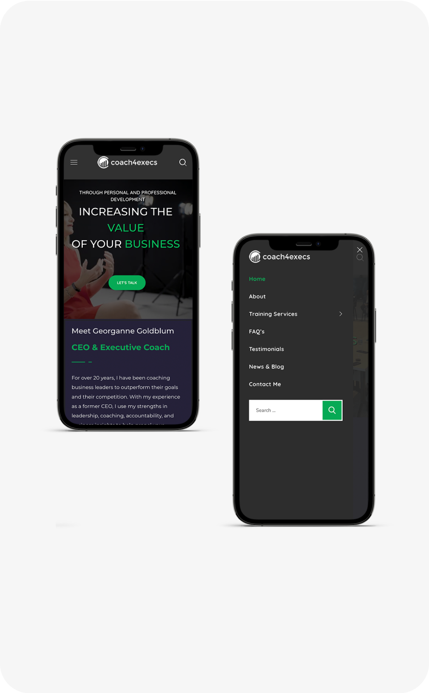
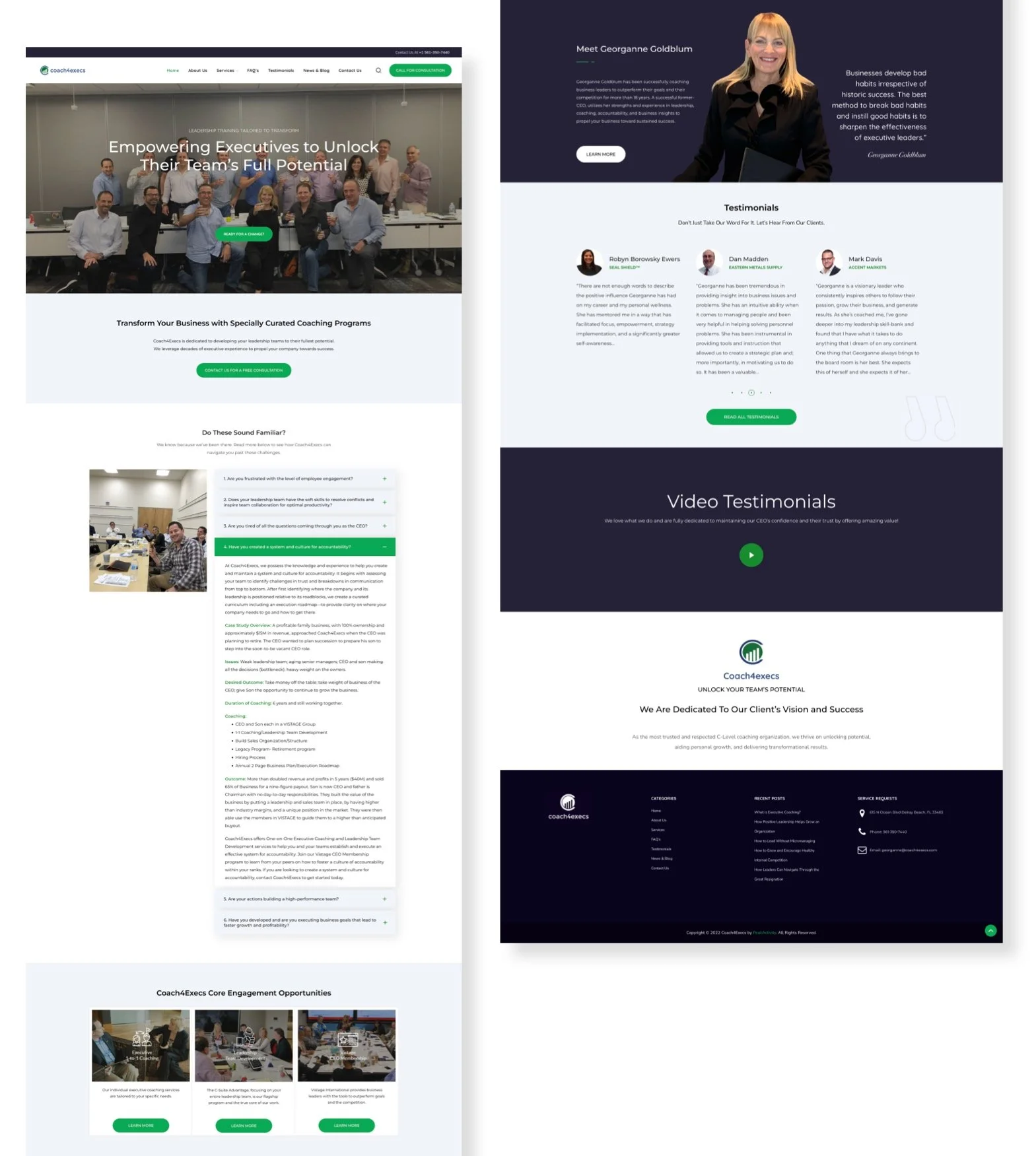
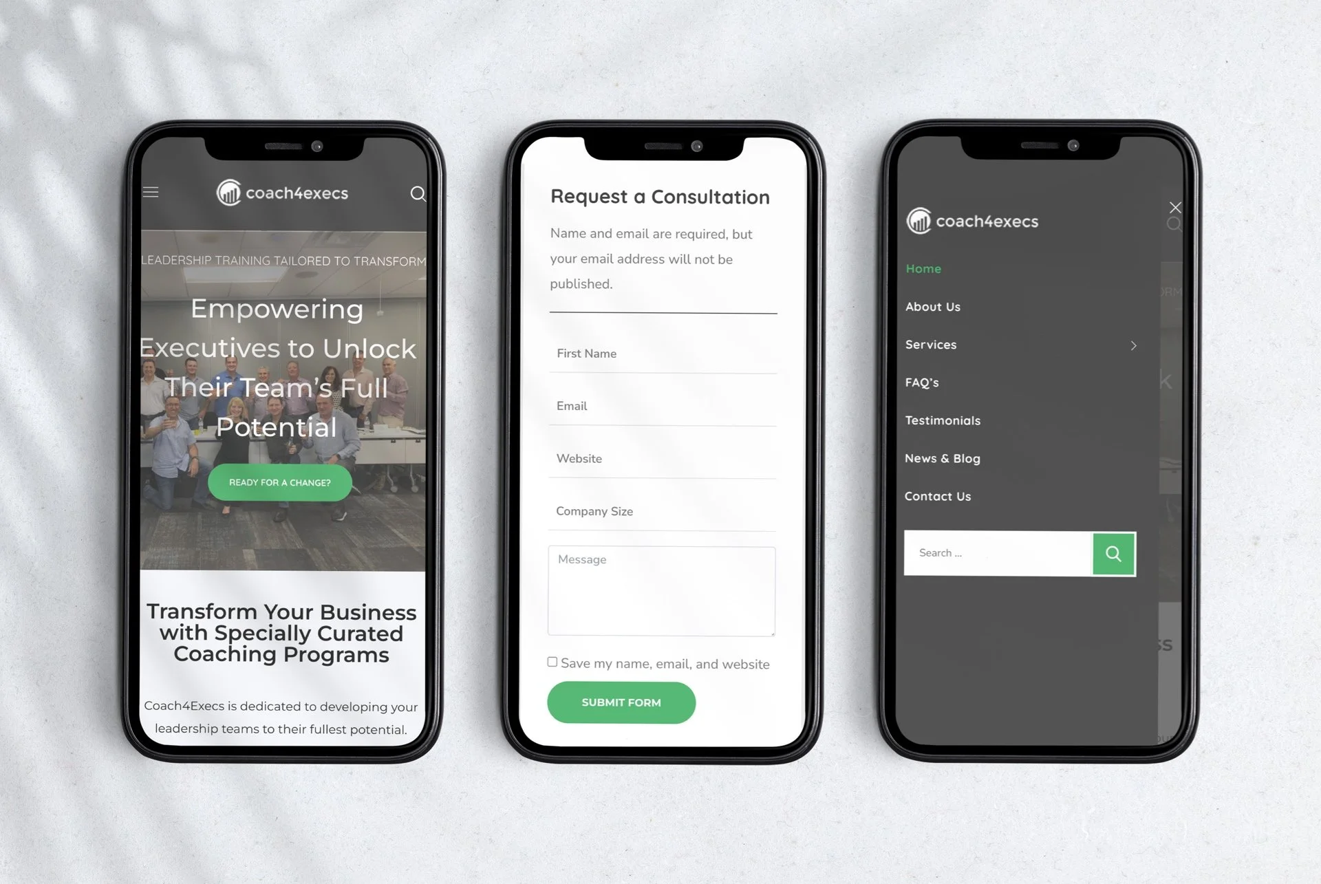
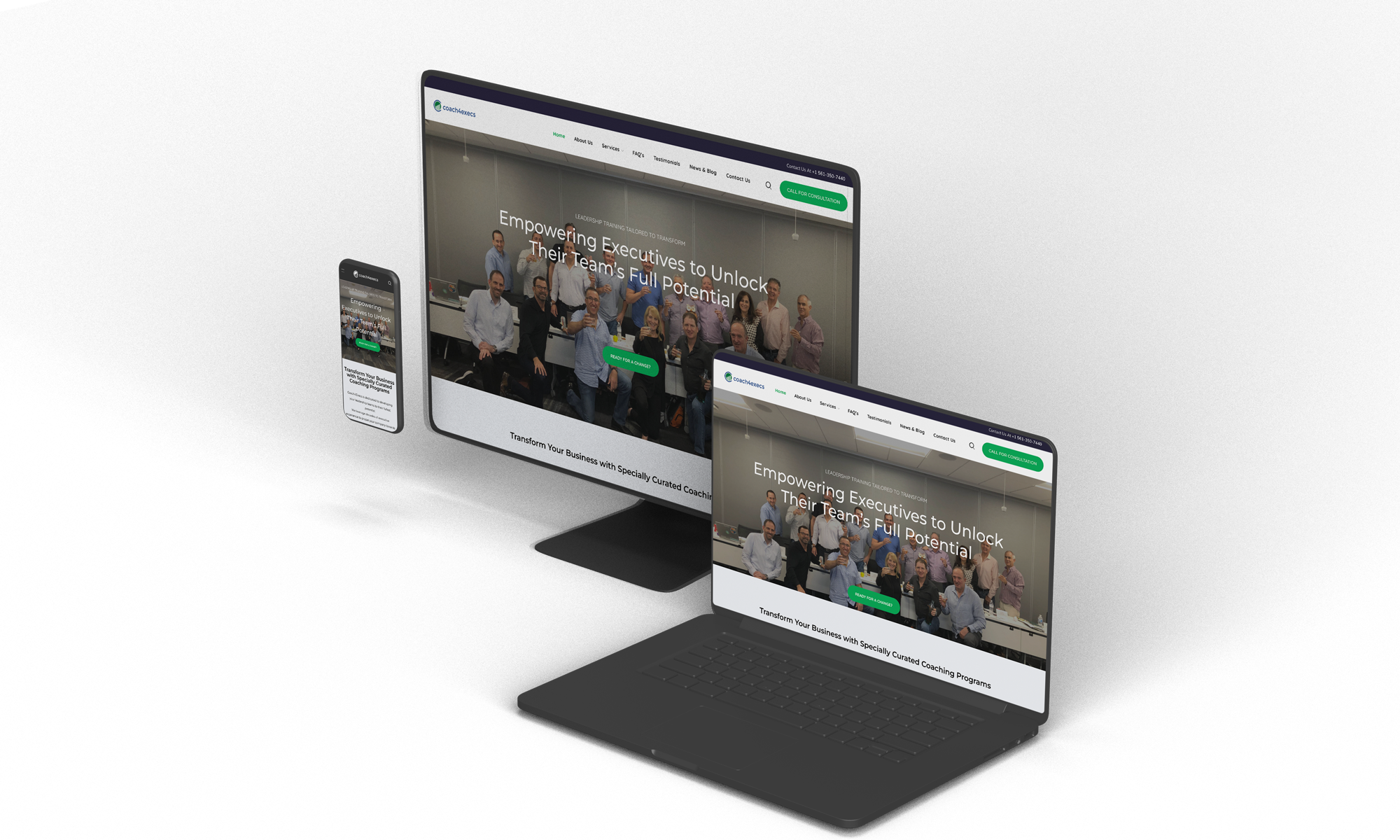
Coach4Execs is dedicated to developing your leadership teams to their fullest potential.
We leverage decades of executive experience to propel your company towards success.
Services provided
Visual Design
UX Research
Website Design
CMS Integration
In this case study, I highlight upon few features that I decided to redesign in Fuelrod and an in-depth analysis of the product and UX Process.
Project Overview
The FuelRod™ is the first reusable, patented, a portable charging system that allows you to fuel (charge) your mobile device on the go, and then recharge or swap for a fresh one.
Goals
The goal of the project was to Redesign the Full FuelRod™ website in a way that highlights its value in a one-stop-shop recharging platform, create better navigation systems and add more useful features such as product checkout, an add-to-cart, and a search bar for a modern e-commerce site; where users can educate, get access to purchase the product and extra items, swap the empty charger, join the membership, find the location of their kiosks, and download the Fuelrod App.
Key Design challenge
Shopify’s overall e-commerce UX performance is decent. It is especially issues related to poor Checkout and mediocre Page Types & Design that detract from Shopify’s UX performance.
FuelRod™, a national-wide portable charger needs a website with modern, up-to-date content, and flexible customer interactivity.
Analysis
Fuelrod's website was on the website builder Shopify, previously and had a few issues such as lack of ability to customize the website.
Information was displayed in a way that poorly conveyed the use of the product the visuals were inconsistent, making the design cluttered and difficult to find what was needed.
The location Map was poorly designed
How it works was hard to understand
The news and Press section did not have any design
Download from the App Store wasn’t clear on the site
The Solution
Enhance and increased readability, creating a one-page landing page mobile-first design, easy to understand information at first glance.
Visual Design
Shown below is a side-by-side comparison of the old and redesigned version of the website. Some of the key changes include improved information architecture as well as a minimalistic design with consistent visuals.

