INTRODUCING LOWES GUIDED SELLING
Behind the scenes of crafting a personalized digital shopping experience.
MY RESPONSIBILITIES INCLUDE:
Research, Journey User Map, Visual Design, Content Design, Product Design, Heuristics Evaluation, Prototypes, Overall Style Guidelines, Iconography, Custom Illustrations, Instructional Video, UX/UI
SUPPORTING PARTNERS:
Product Managers, Lead Products, Software Engineers, Product Researchers, Online Category Manager, Content Strategist, Experimentation/AB Testing, Online Category Managers
Problem:
Over 60% of buyers shop for a major appliance under duress, with little product knowledge. This leads to a 25% return rate due to fit and feature-related issues.
860 results in relevant departments
Search all departments for 'refrigerator'
Solution:
An intuitive shopping experience that inspires, educates and guides customers towards a confident purchase.
13 refrigerators matching your needs
Project Timeline Estimate
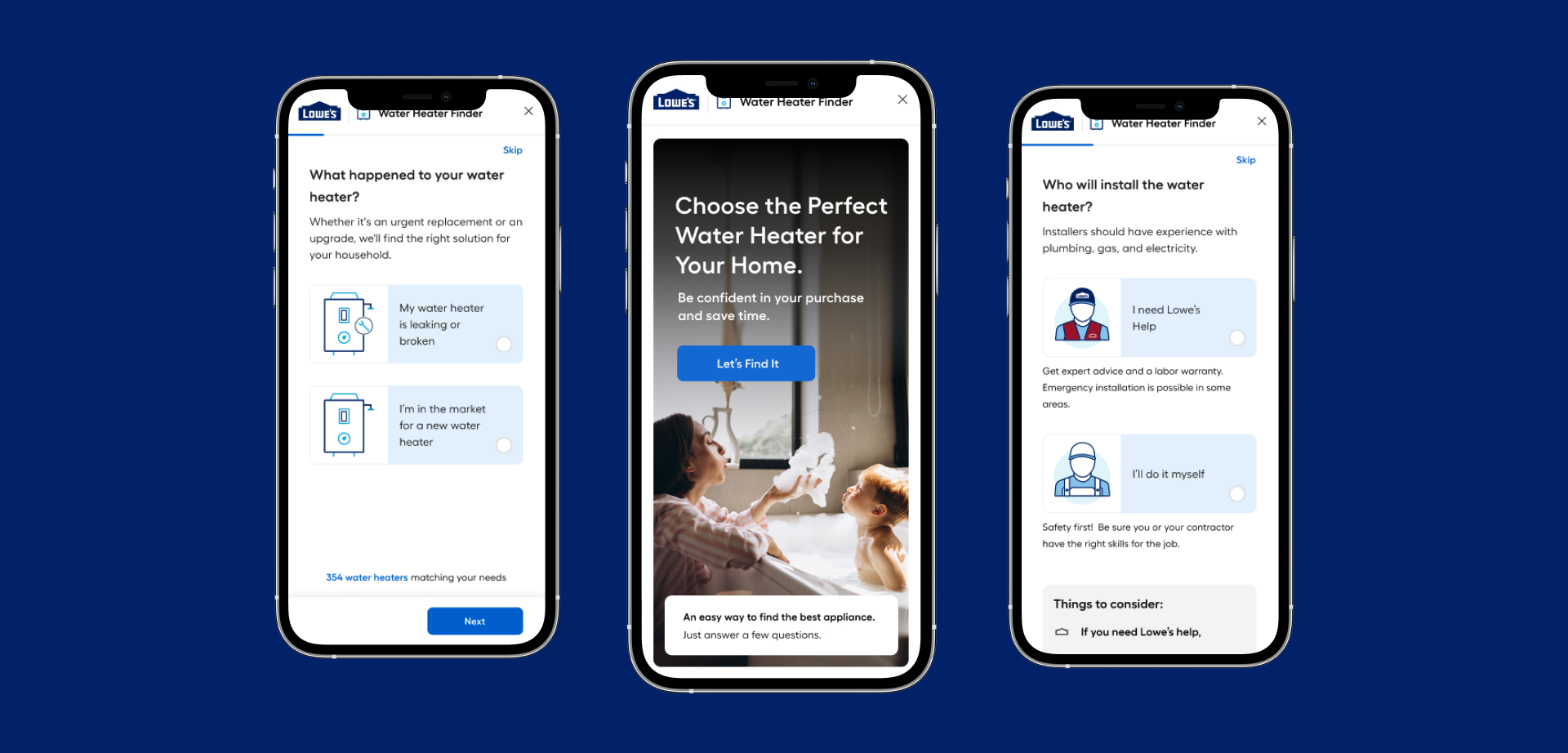
In November 2022 we started the Guided Selling Experience Project, my role was to come up with initial ideas/concepts for entry point to test the first reactions from users, as well as create the foundation from Guided Selling, from there we launched the first MVP Refrigerator Finder in January 2023, as per May/July 2023 we design the 1.0 (Current Design System) as well as 2.0 (Future Stage - Design System) Water Heater branded flow and the Dishwasher Guided Selling.
Design Thinking Process Approach
Step 1
Empathize
We started the design thinking process by researching and looking into different industries from Electric Automobile brands like Tesla (Approachable and personalize experiences) to retailers and other eCommerce and appliances brands like (Bosch, General Electric, Samsung, Crate and Barrel, Walmart, WestElm and Whirlpool.
Brand Name: Tesla Automotive
Experience Name: Schedule a Demo Drive Today
Other Great Products Inspirational Brands
DIGITAL UX-SHOWCASE
Guided Selling Customer Journey Map
From online search, customer sentiment, paint points, we made the Journey Map to be in 5 Steps:
1. Online Search
2. Lowes's Appliance Finder
3. Online Checkout
4. On-Web Checkout
5. In-Store Checkout
Guided Selling Customer Journey Map for Lowes.
STEP 2. IDEATION
Testing: Rapid Prototyping
What else did we do differently?
Frequent qualitative user testing (bi-weekly).
Testing the entire flow and just a few screens.
Iterating designs based on user testing results.
Gleaning insights that could be applied to the entire experience.
UX Design Templates for Developers
Creating UX design templates for developers can streamline the design-to-development process and ensure consistency across projects. Here’s a guide to essential UX design templates that developers might find useful:
1. Wireframe Templates
Basic Wireframes: Simple, low-fidelity sketches to map out the layout and structure of web pages or app screens.
Annotated Wireframes: Wireframes with annotations to explain design decisions, interactions, and functionality.
2. User Flow Diagrams
Flowcharts: Visual representations of the user journey through the app or website, showing the steps and decision points.
Journey Maps: Detailed diagrams that illustrate the user’s experience, including touchpoints and emotions.
3. Interactive Prototypes
Clickable Prototypes: Interactive mockups that allow developers to see how the design will work in practice.
High-Fidelity Prototypes: Detailed prototypes that include design elements, animations, and transitions.
4. UI Component Libraries
Design System: A collection of reusable UI components.
STEP 3 . PROTOTYPE
The Deliverables
Content Manual
A playbook for our OCM and business partners to enable them to create content as guided selling expands across categories.
STEP 4. tEST AND LAUNCH
What did we do differently?
Define Collaboration: We had a number of workshops with the Online Category Management team and vendors and went to talk to store associates. It helped us define
What information is crucial for customers when they select a product?
The right content to convey this information.
Purchasing patterns and behaviors.
Key Takeways
OUR DIGITAL EXPERIENCE INCLUDES:
Consistency Design Pattern and Visual Design
Adaptable, Dynamic, Multi-selection
Rich Detailed and Lifestyle photography
Humanize - Storytelling
Easily navigate to a product list, allowing users to move smoothly
Educational content
Rely very heavily on User Testing and Iterations
Keep the customer First Friendly approach
The Future
Customize Experience based on Personalization Signals: Dynamically update Guided Selling questions/recommendations based on personalization signals like brand affinity, WPRO status, etc.
Seamlessly Connect Online and In-Store Experiences: Offer QR codes in-store to drive to a guided selling experience. Enable customers to start a purchase at the store and finish online later.
Build Whole Home Profile: By gathering information about the customer's home and lifestyle, we can use this to pre-populate guided selling widgets with known information as well as recommend new/next projects.
Final Product Design
Some of the key changes include improved information architecture as well as a minimalistic design with consistent visuals.
Do you Want to Discuss a New Project?
Please tell me a little about your business and what are you looking for.


